I believe most people are mainly visual beings, and I would guess virtually everyone with the capacity for sight has felt stirrings deep within themselves when they see something "beautiful.” The "beautiful" varies between us humans, but we each have the capacity to appreciate what we find beautiful.
I am an artist who primarily paints landscapes, relying on views that make me sigh with pleasure. What grabs my eye varies from mountains to creeks, grasses to trees, cloudscapes to critters. Nevertheless, whatever subject I find beautiful always has elements of contrast in colors, shadows and shapes. Specifically, these are contrasts of lights vs. darks ("values" in artist-talk); contrasts of color (such as yellows vs. violets); contrasts of size and shape (think of a vast ocean view with seagulls flying overhead); as well as movement through the scene that allows the viewer's eye to travel and wander up and down, side to side, forward and back.
Example One: Hoodoo Hillside
This image, west of Hillsboro and seen in full sunlight, was a marvel. The contrasts are dramatic: orange rocks against blue sky and green grass; dark foliage in shadow vs. light green bushes and grass in sunlight; small rock shapes in the distance vs. a large bank of rock in the foreground; and the zig-zag movement of rocks, grass, and foliage that encouraged my eyes to walk up and down the hillside, noticing more and more as I wandered. Everything about it was exciting and dramatic. It grabbed me and I immediately started to paint it mentally, imagining the contrasts I needed to push to ensure it would look as compelling in pastel as it felt in real life.
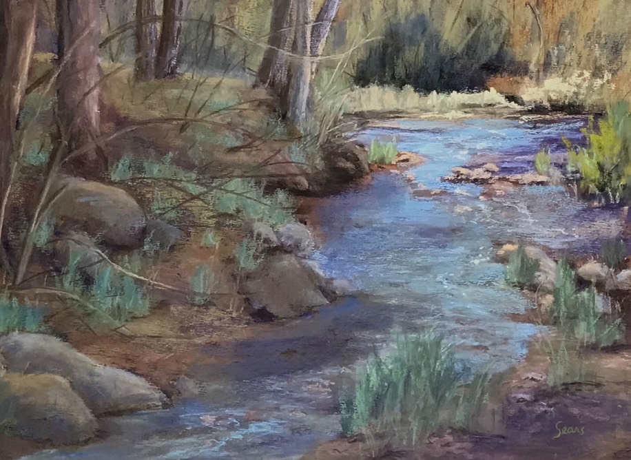
Example Two: Reverence
Although quieter and less dramatic than Hoodoo Hillside, this painting of Percha Creek relies on the same contrast of elements. Value is obvious by the mostly shadowed areas (darks) contrasted to the distant sunlit grasses and bright water (lights). Color contrasts include reddish-brown dirt under blue-green grasses in the foreground, and blues in the water against distant yellow grasses and dull orange in the trees. Size and shape differences are apparent with various rocks, trees and grasses. Movement starts either with the large rocks lower left and moves up the creek to the upper right, or vice versa. There is also movement from left to middle in the graceful, curving, young tree branches.
This quiet, peaceful scene required lots of shadow, with blues and blue-green pastels predominating. I needed to work slowly and thoughtfully to bring out the serenity I felt when I first saw it. No bravado needed here, just gentleness.
It is often difficult to pinpoint exactly why something strikes us as being beautiful. After decades of painting, the why for me has become deeply ingrained in the presence of contrasts. When you are out walking or driving and you find a beautiful sight, I suggest you try to notice the contrasts that are quietly forcing you to find it beautiful: the dark to light values, the subtle or dramatic changes in colors, the variations in size and shapes, and the movement your eyes take when viewing it. For me, nature is a study in contrasts, it knows all the rules, and the beauty we find about us is most likely relying on those rules.
P.S. I mentioned I paint with soft pastels, "soft" because they disintegrate easily. They are shaped like blackboard chalks, but consist not of chalk but rather of pure finely ground colored pigments held together with a minimum amount of binder, allowing them to be shaped into sticks.
Editor’s Note: Melody now paints in Tucson but during her time in Hillsboro we conducted an “interview" with her, featuring her painting. Melody Sears - Pastel Paintings of the Southwest may be viewed in a video gallery on Vimeo (follow title link). It is also an embedded video on our “People of the Black Range” page. Whichever link you follow you will be treated to the technique and philosophy of her art. You may also wish to visit her website: Melody Sears Fine Art.